Date and Time Pickers - Quickstart
Install the MUI X Date and Time Pickers package and set up your date library to start building.
Installation
Install the Date and Time Pickers package that best suits your needs—Community or Pro—along with one of the supported third-party date libraries. The Pickers currently support Day.js, date-fns, Luxon, and Moment.js.
Choose your packages and manager through the toggles below, then run the commands as provided to install:
Plan
Date Library
npm install @mui/x-date-pickers@next

npm install dayjsPeer dependencies
Material UI
The Date and Time Pickers have a peer dependency on @mui/material.
If you're not already using it, install it now:
npm install @mui/material @emotion/react @emotion/styledReact
react and react-dom are also peer dependencies:
"peerDependencies": {
  "react": "^17.0.0 || ^18.0.0 || ^19.0.0",
  "react-dom": "^17.0.0 || ^18.0.0 || ^19.0.0"
},
Rendering a Date Picker
Import the component
Import a Date Picker component and the Localization Provider:
import { DatePicker } from '@mui/x-date-pickers/DatePicker';
import { LocalizationProvider } from '@mui/x-date-pickers/LocalizationProvider';
Next, import the adapter that corresponds to your chosen date library.
Adapters are provided for all supported libraries in both versions of the package.
The snippet below imports AdapterDayjs, which is used throughout this documentation for Day.js integration.
import { AdapterDayjs } from '@mui/x-date-pickers/AdapterDayjs';
Integrate provider and adapter
To integrate your chosen date library with the Date Pickers, wrap your app with the Localization Provider and pass the adapter to the Provider's dateAdapter prop as shown below:
Plan
Date library
import { LocalizationProvider } from '@mui/x-date-pickers';
import { AdapterDayjs } from '@mui/x-date-pickers/AdapterDayjs';

function App({ children }) {
  return (
    <LocalizationProvider dateAdapter={AdapterDayjs}>
      {children}
    </LocalizationProvider>
  );
}Render the component
With the component, adapter, and provider properly configured, you're now ready to render a Date Picker as shown below:
import * as React from 'react';
import { AdapterDayjs } from '@mui/x-date-pickers/AdapterDayjs';
import { LocalizationProvider } from '@mui/x-date-pickers/LocalizationProvider';
import { DatePicker } from '@mui/x-date-pickers/DatePicker';

export default function App() {
  return (
    <LocalizationProvider dateAdapter={AdapterDayjs}>
      <DatePicker />
    </LocalizationProvider>
  );
}
TypeScript
Theme augmentation
To benefit from CSS overrides and default prop customization with the theme, TypeScript users must import the following types. These types use module augmentation to extend the default theme structure.
// Pro users: add `-pro` suffix to package name
import type {} from '@mui/x-date-pickers/themeAugmentation';

const theme = createTheme({
  components: {
    MuiDatePicker: {
      defaultProps: {
        displayWeekNumber: true,
      },
    },
    MuiDateRangeCalendar: {
      styleOverrides: {
        root: {
          backgroundColor: '#f0f0f0',
        },
      },
    },
  },
});
Date value types
The Date and Time Pickers are compatible with several date libraries that each use different formats to represent their dates.
To correctly type all date-related props, the adapters override a global type named PickerValidDate to allow for the formatting of their corresponding libraries.
As a result, TypeScript will throw an error if you try to pass the wrong kind of value to the date library.
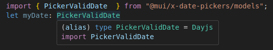
To determine whether your adapter is set up correctly, you can import the PickerValidDate type from @mui/x-date-pickers/models and check its current value.
If the type matches your chosen date library then it's correctly configured:
If the type is any, you can fix this by manually importing the adapter's types directly into your project as shown below:
// replace `AdapterDayjs` with the adapter you're using
import type {} from '@mui/x-date-pickers/AdapterDayjs';
Using this documentation
Localization Provider
For practical purposes, each demo in this documentation has its own Localization Provider wrapper. You should not reproduce this pattern as-is. For almost all use cases, you should wrap your entire app with a single Localization Provider to avoid repeating boilerplate code in multiple places.
Demo Container and Demo Item
Throughout this documentation, the internal components <DemoContainer /> and <DemoItem /> are used in demos to display multiple components with a consistent layout.
You should never use these components in your application.
This helps avoid the repeated use of layout components such as <Box /> or <Stack />, which would otherwise add irrelevant clutter to demos meant to illustrate specific features.